


In today’s data-driven world, health tracking has evolved far beyond simple step counts and calorie logs. We now live in an age where every heartbeat, sleep cycle, and workout can be measured — and more importantly, visualized. The best apps for health data visualization help turn raw numbers into meaningful insights, empowering users to understand and improve their well-being.
Whether you’re an athlete monitoring performance metrics, a patient managing chronic health conditions, or someone trying to live healthier, visualizing your data can make all the difference. Let’s explore the top apps for health data visualization in 2025, each designed to help you see your health story more clearly.
1. Apple Health: The Ecosystem of Wellness Visualization
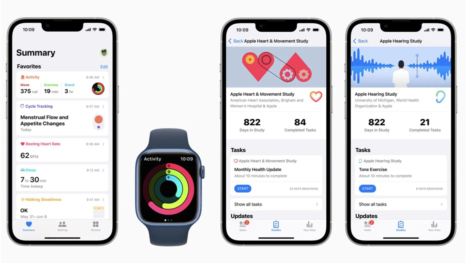
Apple Health remains a leader in health data visualization thanks to its elegant design and seamless ecosystem. Integrated across iPhone, Apple Watch, and third-party apps, it consolidates data on everything from sleep and activity to nutrition and heart rate into one dashboard.
The app’s graphs and charts make trends instantly understandable. You can track how your exercise habits influence your sleep or view heart rate patterns during stressful days. The “Trends” feature analyzes long-term changes, providing context to daily metrics.
For iOS users, Apple Health is more than a tracker — it’s a visual journey into how lifestyle choices shape long-term wellness.
2. Google Fit: Simplicity Meets Insightful Visualization
Google Fit offers a minimalist yet powerful way to visualize health data. With its integration across Android devices and wearables, it captures your activity, heart rate, and goals — displaying them in clean, color-coded visuals that make progress easy to read.
One standout feature is the “Heart Points” system, translating physical activity into measurable health impact. The app’s integration with smartwatches and fitness apps means you can view your daily movements, workouts, and heart health all in one visual timeline.
For Android users or anyone using Google’s ecosystem, Google Fit offers an approachable, visually balanced way to monitor overall wellness.
3. Fitbit: Comprehensive Data Visualization for Everyday Health
Fitbit pioneered personal health tracking, and its app continues to set the standard for visual clarity. Its dashboard turns data from your smartwatch or tracker into easy-to-understand charts for activity, heart rate, sleep, and nutrition.
The app’s strength lies in its colorful graphs and personalized insights — showing not just what you’ve done, but how your metrics compare to your goals and averages. Weekly and monthly trend reports offer a deeper view of your health journey over time.
With detailed visualizations and progress summaries, Fitbit remains a must-have for anyone serious about monitoring daily wellness trends.
4. MyFitnessPal: Visual Nutrition Meets Health Analytics
While best known for calorie counting, MyFitnessPal is also a powerful tool for visualizing nutritional health. Its analytics dashboard transforms your logged meals and exercise data into comprehensive charts that highlight calorie intake, macronutrient balance, and progress toward fitness goals.
The app’s visuals make it easy to identify patterns — like days you overconsume sugar or under-eat protein — helping users adjust diets intelligently. Its integration with fitness devices means you can visualize how your eating habits impact your energy and activity levels.
For those pursuing balanced nutrition or weight management, MyFitnessPal offers visual insights that guide healthier daily choices.
5. Samsung Health: Integrating Lifestyle and Wellness Visualization
Samsung Health offers one of the most visually dynamic experiences for tracking your health. The app gathers data from Samsung wearables and connected devices, presenting it in interactive charts for fitness, sleep, stress, and even blood oxygen.
A standout feature is the holistic dashboard, which displays lifestyle habits — exercise, diet, and sleep — side-by-side for cross-analysis. It helps users see how different factors influence overall wellness.
Whether you’re a casual user or a data enthusiast, Samsung Health delivers a visually engaging and integrated perspective on everyday well-being.

6. Garmin Connect: Athlete-Focused Health Visualization
Garmin Connect caters to athletes and outdoor enthusiasts who love data-driven insights. The app gathers extensive performance data — from heart rate zones and elevation to cadence and VO₂ max — and presents it through precise graphs, charts, and trend summaries.
Each activity you record generates detailed visuals that can be compared across days or weeks. The heat maps and training effect graphs are especially useful for understanding how workouts impact endurance and recovery.
For runners, cyclists, and triathletes, Garmin Connect provides professional-grade health data visualization that enhances performance understanding.
7. Whoop: Visualizing Recovery, Strain, and Sleep Like a Pro
Whoop isn’t your average fitness app — it’s built for those who want deep insight into recovery and performance. Using continuous physiological data from its wearable band, Whoop’s app generates visual summaries of strain, recovery, and sleep performance.
Its color-coded interface (green for recovery, red for strain) simplifies complex physiological concepts into easy-to-digest visuals. The sleep analysis section visualizes how rest, REM cycles, and disturbances affect readiness for the next day.
For users who value recovery as much as training, Whoop offers elite-level health visualization designed for serious optimization.
8. Oura: Holistic Visualization for Mind-Body Balance
The Oura Ring pairs beautifully with its app, which offers minimalist yet insightful visualizations of sleep, readiness, and activity. Its data visualization style focuses on simplicity — making wellness tracking feel intuitive and balanced rather than overwhelming.
The app’s “Readiness Score” visualizes your body’s recovery and energy capacity using beautifully designed graphs. Users can instantly see how factors like sleep and activity influence daily well-being.
Oura’s visuals aren’t just informative — they’re meditative, helping users understand their physiological rhythms with calm clarity.
9. Strava: Data Visualization for Fitness and Social Motivation
Strava combines community motivation with in-depth fitness visualization. The app’s activity graphs and heat maps transform runs, rides, and workouts into shareable data stories. You can compare routes, analyze pace trends, and view weekly summaries that visualize progress over time.
Its Performance Analytics feature allows athletes to see long-term fitness gains and training load through clean, visual dashboards. The social aspect — comparing your visualized stats with friends — adds accountability and fun.
For anyone who thrives on progress tracking and competition, Strava is the perfect visual motivator.
10. Fitbit Premium & Insights+: Advanced Health Visualization
For users who want to go beyond standard graphs, Fitbit Premium (and its Insights+ module) offers advanced visualization features. Users can access deeper analytics — like resting heart rate trends, sleep consistency, and activity correlations — all presented in interactive charts.
The app even offers predictive visuals powered by machine learning, helping users anticipate changes in health patterns before they happen. It’s a futuristic approach to wellness visualization, making Fitbit a pioneer in personalized health analytics.
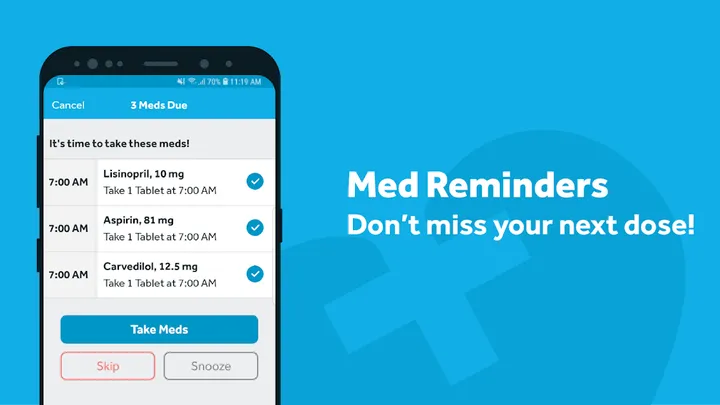
11. MyTherapy: Visual Medication and Health Tracking
MyTherapy stands out as a hybrid health app that visualizes both medication adherence and physical well-being. Its charts display how consistent users are with their prescribed treatments while integrating weight, blood pressure, and symptom data.
The visual medication tracker helps patients identify adherence patterns — an invaluable tool for long-term management of chronic conditions. Its clean design ensures users never feel overwhelmed by data.
MyTherapy merges clinical precision with accessible visualization, making it perfect for patients seeking a complete health overview.
12. Azumio Argus: A Visual Hub for Total Health Metrics
Argus by Azumio integrates fitness, heart rate, sleep, and nutrition tracking into a visually appealing interface. Its unique honeycomb-style dashboard provides a quick snapshot of multiple metrics at once, creating an intuitive, interconnected overview of your health.
Charts and animations make the app feel alive, with progress circles that motivate users to close daily goals. It’s one of the most dynamic visualization tools for anyone wanting a colorful, engaging view of their health journey.
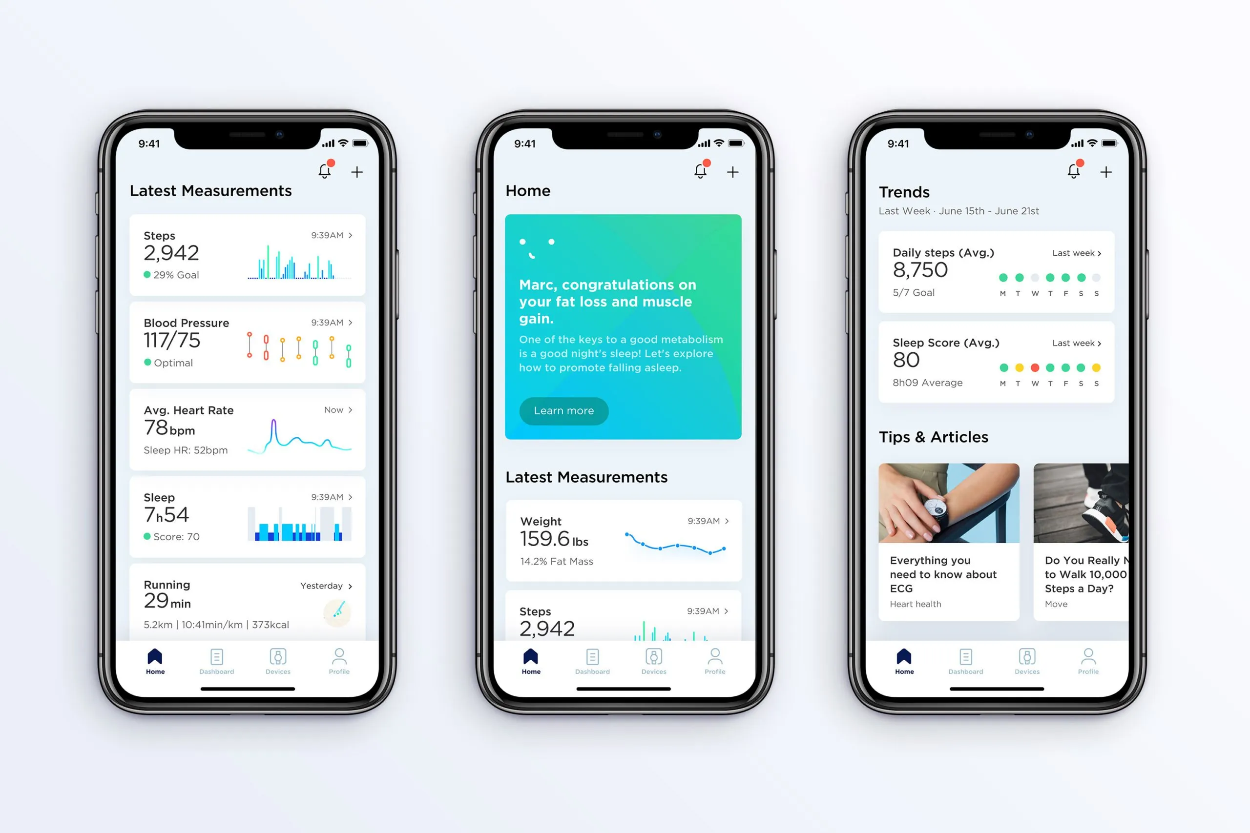
13. Health Mate by Withings: Medical-Grade Data Visualization
Health Mate by Withings takes a medical-grade approach to health visualization, integrating seamlessly with smart scales, blood pressure monitors, and sleep trackers.
Its strength lies in scientific precision — visualizing metrics like BMI, blood pressure, and sleep quality in clinically relevant graphs. The app’s “Insights” tab connects trends to recommendations, helping users translate visuals into action.
Health Mate is ideal for those who appreciate accuracy and professional-level visual reporting.
14. Cronometer: Nutritional Visualization for Health Optimization
For data-driven eaters, Cronometer is unmatched in nutritional visualization. It displays micronutrients, vitamins, and calories through detailed circular graphs and daily summaries.
Unlike most nutrition apps, it focuses on nutrient density, allowing users to see how diet affects energy, immunity, and wellness over time. Visual charts reveal deficiencies and surpluses instantly, helping users make better dietary choices.
For anyone focused on health optimization through diet, Cronometer turns complex nutrition science into easy-to-understand visuals.
15. Future of Health Visualization: AI and Predictive Analytics
The next generation of health visualization apps will leverage AI and predictive modeling to transform how users interpret wellness. Instead of showing what happened, they’ll forecast what’s coming — like predicting stress spikes, fatigue, or illness risks.
As wearables grow more sophisticated, these future apps will visualize multi-layered data — genetics, environment, behavior — all combined into one interactive wellness map. The result will be a personalized, visual health companion guiding every decision you make.
Conclusion: Seeing Health Differently
Health data visualization isn’t just about pretty charts — it’s about empowerment. By seeing trends and connections in your data, you gain the power to make proactive, informed choices about your life and longevity.
From Apple Health’s holistic overview to Garmin Connect’s performance analytics and Oura’s mind-body balance, these apps redefine how we experience health. In 2025 and beyond, the best apps for health data visualization won’t just track your life — they’ll help you understand it.